In a recent conversation with a Hebrew professor, we discussed adding color to Hebrew vowels and accents. If you’re unfamiliar, Hebrew is different from most Western languages in two main ways. First, it reads right to left (or rtl in HTML terms) and second vowels are represented as dots and lines that can be above or below the consonants.
Browsers seem to handle the rtl part pretty well, but they don’t do an awesome job with the vowel points. And for teaching purposes, it’s very hard to make the vowels a different color from the consonants. Below are a few attempts to do this using various combinations of HTML and JavaScript.
Standard Hebrew Text vs. Pointed Text
In the table below, you can see what Hebrew text looks like with and without vowels. Unlike English, when you remove the vowels the word still takes up the same amount of space.
| Hebrew | English | |
|---|---|---|
| Consonants Only | אלהים | lhm |
| With Vowels | אֱלֹהִים | elohim |
Coloring Individual Vowels
The first thing I wanted to try was adding <span> tags around vowels and coloring them differently. In the markup below you’ll see the letters pulled out of order with the English HTML, but it’ll give you an idea of what we’re trying to do.
Markup
א<span class="hebrew-vowel">ֱ</span>ל<span class="hebrew-vowel">ֹ</span>ה<span class="hebrew-vowel">ִ</span><span class="hebrew-accent-minor">֤</span>ים
CSS
.hebrew-vowel {
	color: #ff0000;
}
.hebrew-accent-minor, .hebrew-accent-major {
	color: #00ff00;
}
Demo
| Hebrew | English | Result | |
|---|---|---|---|
| Original | אֱלֹהִ֤ים | elohim | Correct in all browsers |
| Span Colors | אֱלֹהִ֤ים | elohim | Chrome/Safari: colored, but misaligned. Firefox/IE: aligned, but not colored |
Results
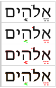
In the example above if you’re using a Webkit based browser on a Mac, you’ll see nice red vowels and green accents. The only problem is that – depending on the font – the vowels are often shifted of place.
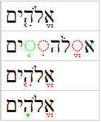
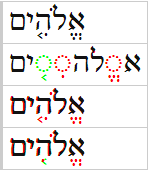
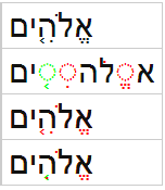
However, if you’re using Firefox or Internet Explorer, the vowels and accents stay in the right place, but apparently Firefox and IE can’t color them – they just stay black and ignore the CSS color. Lastly there is the strange case of PC/Chrome which renders the vowels as as standalone entities with an outline for the missing consonants (see screenshots at the end).
Layering Vowels with Absolute Positioning
Since Chrome can’t keep the vowels correctly aligned and Firefox and IE can’t color the vowels, I decided to try to layer the text using absolute positioning. In the example, I’ve tried putting the accents and vowels on a single layer and splitting them into two layers with different colors.
- Transparent: The bottom layer is the original text used to correctly size the outer
spantag - Green: The second layer has vowels removed and only leaves consonants and accents
- Red: The third layer has consonants removed and only leaves consonants and vowels
- Black: The top layer has only consonants layered on top of the colored layers below
Markup
<span class="hebrew-layers">
	<span class="hebrew-layers-original">אֱלֹהִים</span>
	<span class="hebrew-layers-accents">אלה֤ים</span>
	<span class="hebrew-layers-vowels">אֱלֹהִים</span>
	<span class="hebrew-layers-consonants">אלהים</span>
</span>
CSS
.hebrew-layers {
	display: inline-block;
	position: relative;
}
.hebrew-layers .hebrew-layers-original {
	color: transparent;
}
.hebrew-layers .hebrew-layers-vowels {
	position: absolute;
	top: 0;
	right: 0;
	color: #ff0000;
}
.hebrew-layers .hebrew-layers-accents {
	position: absolute;
	top: 0;
	right: 0;
	color: #00ff00;
}
.hebrew-layers .hebrew-layers-consonants {
	position: absolute;
	top: 0;
	right: 0;
	color: #000000;
}
Demo: Layering
| Style | Demo | Result |
|---|---|---|
| Original | אֱלֹהִ֤ים | Correct in all browsers. |
| Span Colors | אֱלֹהִ֤ים | Chrome/Safari: colored, but misaligned. Firefox/IE: aligned, but not colored |
| Single Layer | אֱלֹהִ֤יםאֱלֹהִ֤יםאלהים | Mostly works. Webkit often misaligns. |
| Double Layer | אֱלֹהִיםאלה֤יםאֱלֹהִיםאלהים |
Mostly works, but messes up accent/vowel pairs |
Results
In this case, all browsers (including Firefox and IE) are now able to render different colors for the consonants and vowels. And, for the most part, they all put them in the right place.
There are, however, two problems. First, is that while IE and Firefox render things perfectly almost all the time, Chrome doesn’t always keep the consonants in the same position across layers and that creates what looks like a text-shadow effect. I love using and developing in Chrome, and this is one of the few ares I’ve ever found Chrome/Webkit to be the worst in an area (Chrome 26 vs. IE 10 vs. Firefox 21).
The second problem is a bit more obscure. Even in browsers that render more consistently (IE and Firefox), the layered solution isn’t perfect if you want a different color for accents and vowels. The reason is that the vowel and accent positions change depending on if a consonant has only a vowel, only an accent, or both an accent and a vowel. You can see this on the middle letter where the red dot [hiriq] and green arrow [yetiv] change positions in the two layers example. Since the accents are typically bigger I put them in a layer underneath the vowel point so the vowel would show up more clearly on top. So this effect is a kind of trade-off that may or may not be worth it depending on your teaching or reading goals.
Font Demos
While Chrome is by far the worst at rendering the layers consistently, all browsers have trouble at times with some popular Hebrew fonts. Below I’m including some popular ones (Ezra SIL and SBL Hebrew) with screenshots of how they render. At the end, there is a demo of an entire verse where problems are even more frequent.
Browser Font Matrix
| Your Browser | Mac/Chrome | PC/Chrome | Mac/Firefox | PC/IE | |||||||||
|---|---|---|---|---|---|---|---|---|---|---|---|---|---|
| Default Font |
|
 |
 |
 |
 |
||||||||
| Ezra SIL |
|
 |
 |
 |
 |
||||||||
| SBL Hebrew |
|
 |
 |
 |
 |
||||||||
| Arial |
|
 |
 |
 |
 |
Full Sentence Demo
I have this running in a Bible application:
Bible Web App: Hebrew style
And here is entire Hebrew sentence marked up in all the styles:
| Original | וְהָאָ֗רֶץ הָיְתָ֥ה תֹ֙הוּ֙ וָבֹ֔הוּ וְחֹ֖שֶׁךְ עַל־פְּנֵ֣י תְה֑וֹם וְר֣וּחַ אֱלֹהִ֔ים מְרַחֶ֖פֶת עַל־פְּנֵ֥י הַמָּֽיִם׃ |
|---|---|
| Span Colors | וְהָאָ֗רֶץ הָיְתָ֥ה תֹ֙הוּ֙ וָבֹ֔הוּ וְחֹ֖שֶׁךְ עַל־פְּנֵ֣י תְה֑וֹם וְר֣וּחַ אֱלֹהִ֔ים מְרַחֶ֖פֶת עַל־פְּנֵ֥י הַמָּֽיִם׃ |
| Double Layered | וְהָאָ֗רֶץוְהָאָרֶץוהא֗רץוהארץ הָיְתָ֥ההָיְתָההית֥ההיתה תֹ֙הוּ֙תֹהוּת֙הו֙תהו וָבֹ֔הוּוָבֹהוּוב֔הוובהו וְחֹ֖שֶׁךְוְחֹשֶׁךְוח֖שךוחשך עַלעַלעלעל־פְּנֵ֣יפְּנֵיפנ֣יפני תְה֑וֹםתְהוֹםתה֑וםתהום וְר֣וּחַוְרוּחַור֣וחורוח אֱלֹהִ֔יםאֱלֹהִיםאלה֔יםאלהים מְרַחֶ֖פֶתמְרַחֶפֶתמרח֖פתמרחפת עַלעַלעלעל־פְּנֵ֥יפְּנֵיפנ֥יפני הַמָּֽיִםהַמָּֽיִםהמיםהמים ׃ |
Conclusion
Right now, it seems there isn’t a perfect HTML/CSS way of colorizing the Hebrew pointing system, but the layering solution seems best for making it work across browsers as long as you don’t mind the accents being slightly out of place.
If you have any other ideas, please let me know!
Have you looked at the HTML ruby system? http://dev.w3.org/html5/spec/text-level-semantics.html#the-ruby-element
It’s traditionally considered a feature for Chinese & Japanese but I believe it’s flexible enough to support your uses as well.
Yes, I love the Ruby system. It’s great for Asian languages as you mentioned as well as producing things like Interlinear Bibles (where Greek and Hebrew words appear above English or vice versa). However, as far as I know, Ruby isn’t designed for semitic languages like Hebrew and Arabic. They have their own complex system of glyphs and ligatures which position symbols like vowels and accents above and below letters as well as transform the consonants based on their contextual position. But it appears that attempting to mix colors disrupts that system. But like you mentioned, I could try using Ruby to produce the same layered effect, and it might offer a slightly more semantic approach.
I ask some help to figure out how to work with your player but I saw that you spend your time playing with “Seminary” stuff. As much as I acknowledge the hebrew word for the name of GOD is not the best example of an experience with letters, vowels, colors … and lack of direction to produce something more productive in live…. I am sorry……….
The stamps are valid for 3 months over the summer.
Then, we’re abc going to have a statement from the
Royal Mail website. Hirschman was inclined toward a
kind of deep justification or deep criticism of the inequality structure.
Regardless of whether you have an online business and you
choose to mail your return, go to your bank. Ignoring the problem will not work.
If you’re talking about stereotypes throughout history, liberals and Democrats have always
been the party that can’t be abc solved by higher taxes.